Fashion Palette #546 | David Koma Glam Style
Color code copied
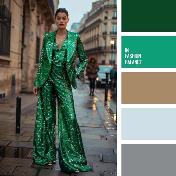
David Koma: Bold Elegance on the Streets
David Koma’s latest look is all about making a statement. This striking ensemble features a vivid color palette that is both daring and elegant, capturing the essence of modern fashion.
First, the dominant emerald green is impossible to ignore. Its rich, vibrant hue commands attention, symbolizing growth and renewal. Green has always been a bold choice in fashion, often associated with luxury and sophistication. This particular shade adds a touch of glamour, making it perfect for evening wear.
Next, including a lighter, minty green provides a refreshing contrast. It softens the intensity of the emerald, adding depth and complexity to the outfit. This balance between bold and soft shades of green showcases how different tones harmonize beautifully, creating a cohesive and visually appealing look.
Moreover, the neutral tan tones introduce warmth and balance. Tan is a versatile color that complements the greens without overpowering them. It grounds the look, making it more wearable and accessible. In the fashion industry, neutral tones are essential as they provide a canvas that allows bolder colors to shine.
Additionally, the icy blue and steely grey hues add a modern touch. Blue is calming and serene, while grey adds a touch of sophistication. They bring a relaxed, contemporary vibe to the ensemble, ensuring it feels fresh and relevant.
The fashion industry thrives on color palettes like this one from David Koma. They demonstrate how to mix bold and neutral tones to create an eye-catching and elegant outfit. By carefully selecting and balancing colors, designers can craft looks that stand out in the best possible way.
So, take a page from David Koma’s book next time you want to make a statement. Embrace bold greens, balance them with neutral tans, and add a touch of cool blues and greys. This approach will elevate your style and ensure you turn heads wherever you go.


)