Fashion Palette #520 | Paul Smith Style
Color code copied
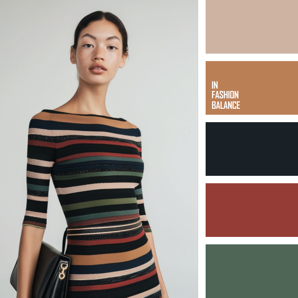
Paul Smith: Casual Elegance in Stripes
Paul Smith’s latest look perfectly blends casual elegance and vibrant sophistication. The color palette, featuring taupe, warm caramel, deep navy, rich red, and forest green, creates a dynamic yet balanced ensemble.
Taupe is the foundational color, lending the outfit a neutral yet warm undertone. This versatile hue works seamlessly with the other colors, providing a subtle backdrop that enhances the overall design.
Warm caramel introduces a cozy, earthy element to the palette. Caramel is known for its inviting and rich qualities, making it an excellent choice for creating a sense of warmth and comfort in casual wear. This color harmonizes beautifully with the deeper tones, adding depth to the outfit.
Deep navy anchors the look with its classic and timeless appeal. Navy is a staple in fashion, often used to convey sophistication and stability. This palette adds a grounding effect, balancing the more vibrant hues.
Rich red infuses the outfit with a touch of boldness and energy. Red is a powerful color that commands attention, and here, it breaks the monotony of the neutrals, adding a pop of excitement.
Forest green rounds out the palette with a touch of nature-inspired calm. Green is associated with growth and harmony, refreshingly contrasting the warmer tones.
In the fashion industry, this color palette demonstrates the art of combining bold and neutral hues to create versatile and eye-catching designs. Such palettes are essential for casual wear, offering both comfort and style. The mix of colors ensures the outfit stands out without overwhelming, making it suitable for various occasions.
In conclusion, Paul Smith’s casual look is a masterful example of how to use a diverse color palette to create a harmonious and stylish ensemble. Embrace this palette to achieve a chic, effortless look that transitions seamlessly from day to night.


)